

The Sitting Hun
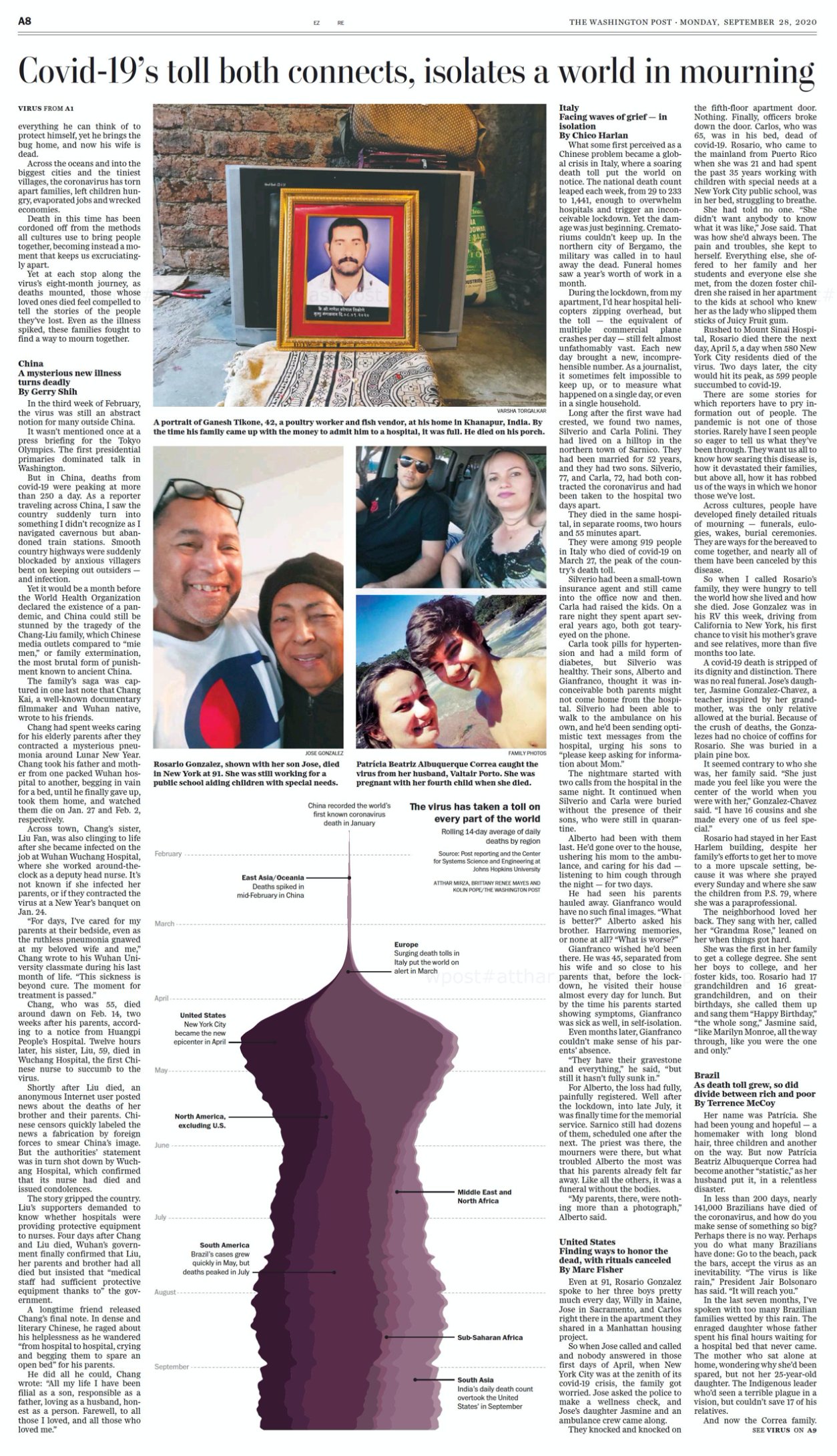
I created a data visualization for a story marking when the global coronavirus death toll passed 1,000,000 deaths, a statistic very difficult to imagine. The visualization broke that number down using a streamgraph coded in D3. It shows how many people have died every day since the pandemic began.
In a way, this is the story of the entire pandemic to date. You can see the early coronavirus-related deaths in China, the surge in Europe and subsequently the U.S., the rising death toll in India — and one day, hopefully, a return to the sharp point at which we started. Read the full story here.
The project went through several iterations before reaching the final design and color scheme. It was even adapted for the print paper.
09.28.2020