

The Sitting Hun
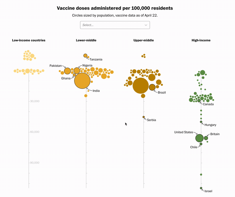
I took a look at the widening gap in vaccination rates between high and low income countries, and built an interactive data visualization and a series of dynamic charts for the final published story. You can see it here, and a version of the chart also shows up in the Washington Post’s worldwide pandemic tracker here.
In addition to getting more familiar with advanced D3 techniques (such as voronoi interaction and force simulation), I also learned how to integrate it with React. Part of my process for coding the chart can be seen at my Observable notebook, here. The project was featured on the homepage and seen by thousands.
05.06.2021